Max App
Max is a leading credit card company in Israel, with over 1 million users on their app. I joined Max’s redesign team, who created the strategy and design for max’s next step in an ongoing evolution.
Read also about Max Abroad
Commercial Work
Experience Designer for Designit, Tel Aviv

The Challenge
How to Convey Complex Financial Information Hierarchies at One Glance
The new version enables users to review their financial assets at a glance and at the same time invites them to explore and discover new possibilities that can suit their needs, all while maintaining (and upgrading) the product experience. As part of a product team, we had to figure out collectively how to communicate complex financial information hierarchies in a very simple and direct manner, without overloading the user with information — showing him the big picture of his finances in a digestible format.


The Process
Creating a Modular System
We started our work by breaking down all of the states available for the users and how to create a system that works for all of their possible needs while still being comprehensible and accessible. Our biggest challenge was creating the system as a modular one: how can we make sure the users’ financial status is understood, using very small component that convey all the information they need?
On the right: example of the app’s information architecture
The Strategy
Rearranging the User’s Financial Assets in a New Order
One of the key features is the ability to easily manage both your “fast money” and your ”slow money.” ”Fast money” refers to the funds that you need access to quickly, such as your credit expenses, foreign currency etc. "Slow money” refers to your long-term investments and other financial assets that you don't need to access on a regular basis.
To tackle this, we added the financial assets carousel: a convenient addition to the app, that still works seamlessly with the existing version of the app and does not disrupt users who’ve grown to certain usage standards.


Evolving with the Brand
Rebranding Max
As part of MAX's growth and evolvement, I joined to the rebrand team and contributed to creating a refreshing visual language for the brand.
We decided to update, refine and enhance MAX's visual language so it will match their current positioning in today’s market: a popular and well based company with diverse products, offerings and portfolio for every type of client.


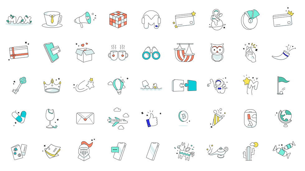
Refreshing Illustrations
The brand refreshed look included creating about 80 illustrations that continues the brand's fun look and feel.